


Here is our
SECOND instalment of WEEKLY COGWHEELS. We cannot believe it, can you? Anyway,
this issue is even bigger than previous one. Me, Andrew Stroke, and our [now
promoted to] regular resident WUTYA are going to discuss comics! What a shocking
revelation!

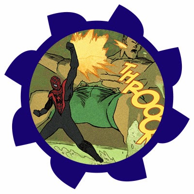 All-New Ultimates #7
Writer: Michel Fiffe
Artist: Giannis Milonogiannis
Colours: Jordie Bellaire
THIS comic book. THIS FREAKING COMIC BOOK. It probably has the coolest
line-up of creators! Written by Michel
Fiffe, author of “COPRA”, drawn
by Giannis Milonogiannis (“Prophet”, “Old City Blues”) and coloured by Jordie Bellaire (Eisner-award winning colourist, she worked on
everything from “Moon Knight” to “Nowhere Men”). The line-up is awesome.
Why doesn’t it work here?
“All-New Ultimates” was launched as one of three “Ultimate”-line books, and is written by Michel Fiffe and previously drawn by Amilcar Pinna. It has a tone of both
80s movies about street gangs, fighting in neon lights, and comic books of that
time. I kept myself distant from this book, because the story was weak and
Pinna’s art did not do it any favour. But I’ve been waiting for Milonogiannis
to step up as an artist. Giannis is also fond of 80s style, so he seemed like a
good fit for the book…
…but he was
not. The artwork here is not as detailed, as any other Giannis’s work. It feels
empty and unfinished. The backgrounds especially look blank, whether its sewer
tunnels or the interrogation room. There are some “Old City Blues”-related Easter eggs on the final pages - probably,
the most well done pages in the whole issue. Drawn battles look dynamic, but
not that cool - the characters are drawn as empty, as background.
And I don’t
know, what’s gotten into Jordie Bellaire,
but those colours are dark and muddy even for sewer tunnels. Coincidentally, Rachelle Rosenberg was also providing
some hideous colouring on “Ultimate FF”,
though her other works look great. I guess, they just don’t pay them enough for
working on “Ultimate”-line.
And as to
the script, Fiffe still fails to grab readers’ attention. Aside from Miles
Morales (who is Ultimate Peter Parker’s rip-off and Bendis writes him as one) or Kitty
Pride (who was written horribly for the previous two years), Ultimates
is an assembly of undeveloped characters, and it stays that way. Michel Fiffe
does not make those characters likeable, though, he certainly attempts to.
Still, the script is weak, and even when certain pieces of a big scheme come
together, it not entertaining to follow.
Bury it,
already, let the great authors create great stuff and not… this.
 POP #1
Writer: Curtis PiresArtist: Jason Copland
Colours: Pete Toms
“POP” lives up to what it promises. The concept of artificially
manufactured superstars is definitely not new (it was used in “Gravity Falls” for example), though it
is brought in an appealing and entertaining manner. The issue jumps right up to
the point, without any long introductions, so that reader can grasps onto what
is going on quickly. “POP” examines pop-cultural creations as a product for
consumption, and not the product of art. It views superstars as an expendable material,
which runs out of date, and could be easily replaced.
So, one of
the test-tube pop-stars runs away from evil conglomerate and hides at a random dude's place, putting both their
lives in danger. Pretty basic plot, though it catches your attention
with a quick succession of events. Also Justin Bieber gets shot here twice.
Jason Copland’s art is not very detailed and characters’
emotions sometimes do not resonate with their intended emotions, though it
looks great with Pete Toms’ bright
colours.
Nice read,
to say the least.
 Avengers #34
Writer: Jonathan HickmanArtist: Leinil Yu
Colours: Sunny Gho
I’ve
dropped reading Jonatan Hickman’s “Avengers” a year ago, but the concept of
great leaps in time seemed at least intriguing to me. And I’ve tried this latest arc (##29-34). The plot goes like this: Captain America discovers, that Iron Man betrayed him,
and so Avengers decide to have a little chit-chat with Tony. Suddenly Time Gem appears in Steve’s hand and
shatters, dragging Avengers into distant future. Each issue team jumps even
further in time, until there is nowhere to go forward.
It is not
the first time, when Hickman brings Marvel Heroes into the future with such
leaps - during his “Fantastic Four” run,
Reed
Richards has taken similar ride. Still it proves that Hickman operates
with fantasised world better than with “real” one. It is much easier to handle
invented world’s laws and take away the attention from the characters.
Hickman’s run on “Avengers” was never about the Avengers - they are always a
force and a tool in his hands. And here it does not really matter who is
jumping forward in time. What matters here is the astounding view of different
eras and their comparison with present day Marvel Universe.
I would not
pick Leinil Yu to illustrate this
story, but his work seemed appealing. It is worth mentioning, that Yu provided
different designs for Avengers of various epochs. They look nice. However, Yu’s
backgrounds and exposition of the future look much better, than characters
emotions. Somehow, Hickman and Yu made a connection on this one, heh.
I have to
say, this arc got me hooked on Hickman’s run. I might want to follow it, since
it is heading towards its end.
 Megahex
Written and drawn by Simon Hanselmann
If you
never read “Megg, Mogg and Owl” by Simon Hanselmann, you are not living up
to your life’s potential, I dare to say. “Megg, Mogg and Owl” is a web-comics,
that has been published at various sites, most notably Simon’s tumblr.
It is a stoner-comedy about three anthropomorphic idiots with no set goals in
life and a big love for weed and sitting at home. You won’t find a comic book,
that balances between depressive tunes and disastrous comedy so smartly as
“Megg, Mogg and Owl”.
“Megahex” is a big collection of “Megg, Mogg and Owl”
material. It is much more easier to read In collected editions, than in
web-comic format, so I recommend to check it out. Grim humour, drugs fantasies,
and friends, which you would not like to hang out with. Except Werewolf
Jones, probably.

 Wayward #1
Writer: Jim ZubArtist: Steve Cummings
Colours: John Raunch & Jim Zub
I am not acquainted with “Buffy”
and I cannot judge how much “Wayward” is
similar to “The Vampire Slayer”, but
if “Wayward” is next generation’s “Buffy”, the original source must be really
bad. Which is doubtful, since it lasted for 8 seasons, created a spin-off and
still publishes in form of comics. One conclusion, that I can make - “Image” PR-managers
were grossly overestimating this book.
The protagonist of the story is half-Irish/half-Japanese girl Rori
Lane, which travel to her mother in Japan after her parents separated.
We learn it from a long opening monologue. Rori is a very mediocre narrator, by
the way. She cannot tell anything interesting about herself, so instead we are getting
detached comments about what’s happening on a page. And we also learn, that
Rori has a superpower - she can see pathways.
From this moment comics goes straight from
point A to point B. Rori arrives into new house, walks in Tokio, does some
shopping, and then the plotline starts. Japanese mythical monsters, disguised
as people, are attacking her and she gets help from cat-girl Ayane.
At the end of an issue, reader is left in the same confusion as the main
heroine, because script writer Jim Zub
had no time to explain anything.
We did not get know anything about Ayane, although we can presume she
has an army of homeless cats. Kappas
are anthropomorphic evil ninja turtles, not much information on them either.
Although they can be drowned in garbage, that’s how they were beaten.
I did not like the scenario, but artwork here is far better: Steve Cummings mixes the stylistics of
manga and western comics, Rori’s look is distinctive and hard to be lost in a
crowd, and designs are looking felicitous. However, artwork is getting worse
sometimes, and instead of backgrounds, there are naked monotonous walls. Still,
when Cummings tries to put as many details as possible, it looks well.
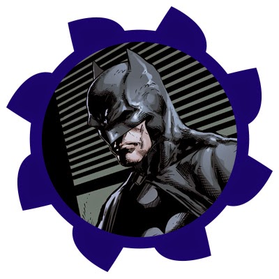 Batman Eternal #21
Writer: Scott Snyder, James Tynion IV
Artist: Jason Fabok
Colours: Brad Anderson
You may have read my monthly reports about Batman Eternal. I’ve
read each issue, that was published within a month, and then shared my opinion. Usually I criticised this comics. I decided not to write about July’s issues - they were plain horrible, I don’t want to talk about that. It
was hard to read without painful tears, because Ray Fawkes was writing three issues in a row. The art was
mediocre, and long-playing plotlines were closing down too soon. This method of
writing comics continued in August.
The plotlines about Arkham
closed in July with an appearance of Deacon Blackfire, and we probably will only see what
is going on there in 10 issues or so, as it was previous time. Red
Robin and Harper Row (aka Blue Grifter) were forgotten as well. Stephanie Brown came back as Spoiler. Nobody tells us, where she got the costume,
though this plotline is valuable only for fans, that demanded to bring Stephanie
into the The New 52. I remember that her father turned out to be a villain
(also he resembles Jack Horner from Fables), but this does not tie into any
other story yet. The story of Batgirl,
Red Hood and Batwoman is now logically completed, and heroes even found the proof, that Jim Gordon is innocent. Gordon also learned
that Leo is a criminal boss Rex Calabrese, and probably the father of Selina Kyle.
21th issue started the “second act” of “Batman Eternal” had we learned who framed Jim Gordon. Snyderlings also introduced The Architect, the villain of “Batman:
Gates of Gotham” by Scott Snyder and Kyle
Higgins.
Generally speaking, I cannot say, that I dislike all those cliffhangers. “Gates of Gotham” was great, and it seems as “Eternal”
positions itself as its sequel. Even enemies line-up coincides. I just don’t care about 60 issues
long sequel, that is filled with unnecessary plotlines. I hope you would not
like to read that too.
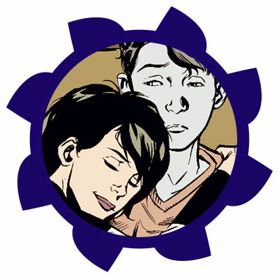 Dead Boy Detectives #8
Writers: Toby Litt, Mark Buckingham
Artists: Mark Buckingham, Ryan Kelly
Colours: Lee Loughridge
Ghosts of teenagers Charles Rawland and Edwin Paine debuted on the pages of “Sandman”. Dead Boy Detectives rarely appeared in the comics, though
they had a limited series from Ed
Brubaker and graphic novel by Jill Thompson. With a publication of The Sandman: Overture in 2013, Vertigo launched an
ongoing series, written by Toby Litt
and Mark Buckingham, and drawn by Buckingham
and Gary Erskine.
Two dead boys are now accompanied with an alive girl Crystal Palace, whom boys have rescued from death.
Suddenly, Crystal transfers to the school of St. Hillarion, where Charles and
Edwin were killed. Heroes learn why they were killed, save Crystal once more
and now are looking for new adventures.
This issue repeats the trick of the first one: the page is separated
into two parts, and the events are shown from both points of view - Edwin’s and
Charles’s. The book reminds us, that Dead Boy Detectives are friends, which are
on good terms with each other even when both of them are from different eras.
We also get a progression in love line between Charles and Crystal, and an
evident conflict impends between Crystal and Miranda, Charles’s niece.
One thing I dislike is the inscription “From the pages of Sandman” on the cover, which strips the comics
from its self-sufficiency just a little. There is also no
detective component - all the problems are solved trivially, but those are just
my knocks.
Artists (Gary Erskine, Russ Brown, Ryan Kelly) are rotating with
each arc, but the art itself is left in a same pleasant stylistic. Most part of
the work is after Mark Buckingham, with other artists finishing his layouts. It
gives Buckingham has time for “Dead Boy Detectives” and soon-to-be-closed “Fables”. Jamie McKelvie and Mike Norton, while working on Young Avengers (it’s not WCW, if Young
Avengers are not mentioned at some point, right?) used approximately the same
trick.
“Dead Boy Detectives”
are far from the best Vertigo comics, but it is probably the best one right
now.
 Wolverine & the X-Men #8
Writer: Jason Latour
Artists: Paco Diaz, David Messina, Gaetano Carlucci
Colours: Israel Silva, John Kalisz
First arc of “Wolverine & the X-Men” was tedious and boring afterword from “Battle of the Atom”.
Regular artist Mahmud Asrar left the
series after 5th issue, and three months in a row the comics is
drawn by several people. For example, 6th issue was drawn by 5
people. #8 is drawn by trio: Paco Diaz, David Messina and Gaetano Carlucci.
The events of an issue take place in a miniature “World”, where time
runs faster, than in our world. Wolverine and Storm went there on a
date, that lasted for a year. Their relationship - is another topic for a
discussion. In “New Avengers” Storm
sleeps with T'Challa,
in “Wolverine” Logan and Ororo separated, and in both “Storm” and “Wolverine & the X-Men” they are still together. The chronology of
events is absent at all, so there is no way to be anxious about their
relationship. It is editor’s fault in a first place.
It is hard for me to write about this volume without looking back at the
work of Jason Aaron. Aaron was capable to write light and witty dialogues, Jason Latour, however, overloads his
dialogues, and characters spend most of their time arguing. Latour is not very
experienced writer, and he is far better at drawing. I am not going to be sad,
if this series will be cancelled. “Wolverine & the X-Men” died at
the start of the year, that is when Jason Aaron left.
No comments:
Post a Comment